drift festival: laatste dans
Client: DRIFTOMTEDANSEN (self initiated) | role: artdirector and graphic designer | year: 2026
the brief
After 15 years as a fixture in Nijmegen's electronic music scene, Drift Festival announced its final edition. The challenge wasn't to advertise one more event. it was to mark the end of an era, and give people a reason to show up one last time.
the concept
Fifteen years of Drift isn't a list of editions. it's a collection of memories. The campaign is built around a single question: what does a memory actually look like? The answer became the concept "one last time": a final chance to feel these moments before they're gone.
Creative direction
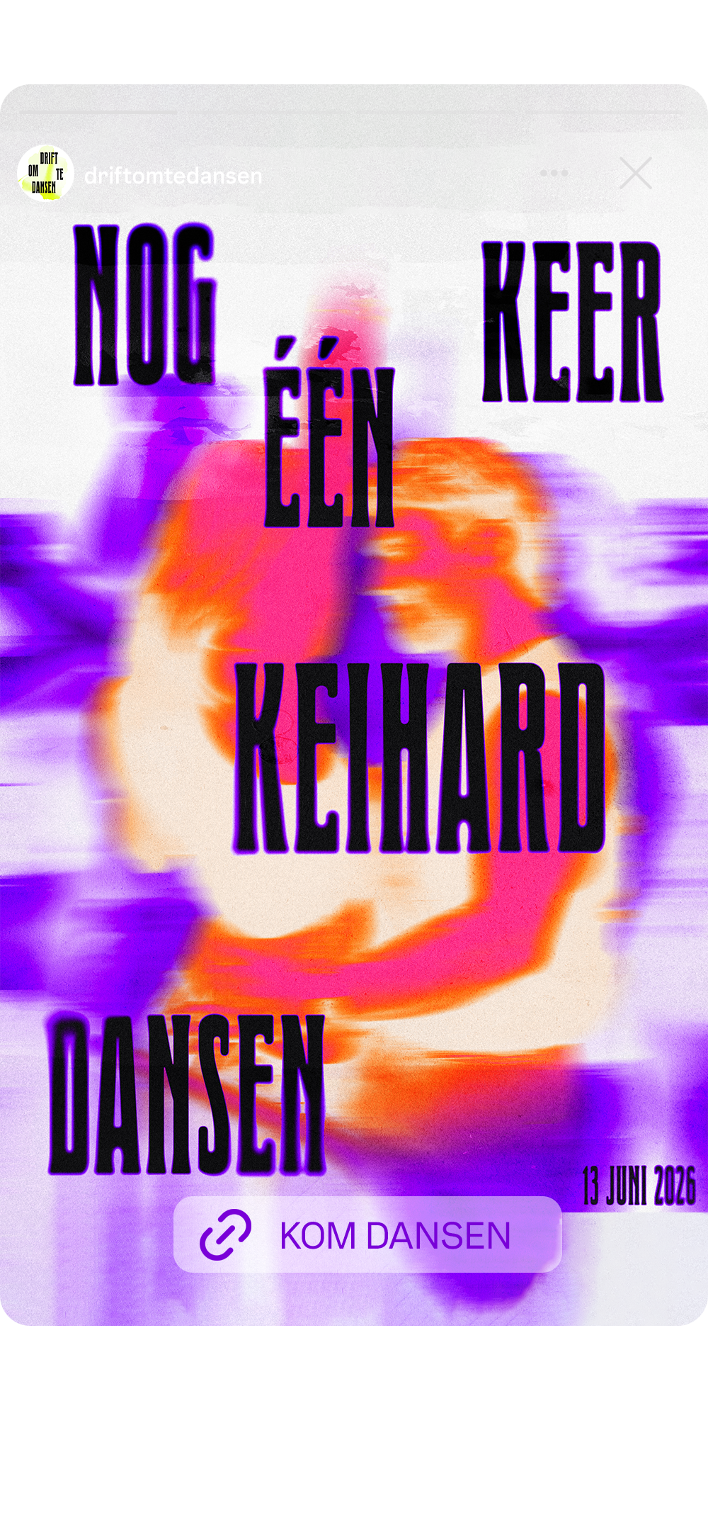
Memories aren't sharp. They come back blurry, fragmented, imperfect closer to a faded analogue photo than a clean digital one. So instead of polished, high-production visuals, the campaign leans into blur, grain, and imperfection as its aesthetic. Warm club-orange and purple carry the festival's original identity through, paired with Drift's own expressive typeface
Collective/connection
people, emotions, interactions
THe visuals of the campaign all involve one of the things that are what makes drift, drift: the people, the emotions and the interactions.
Hero poster
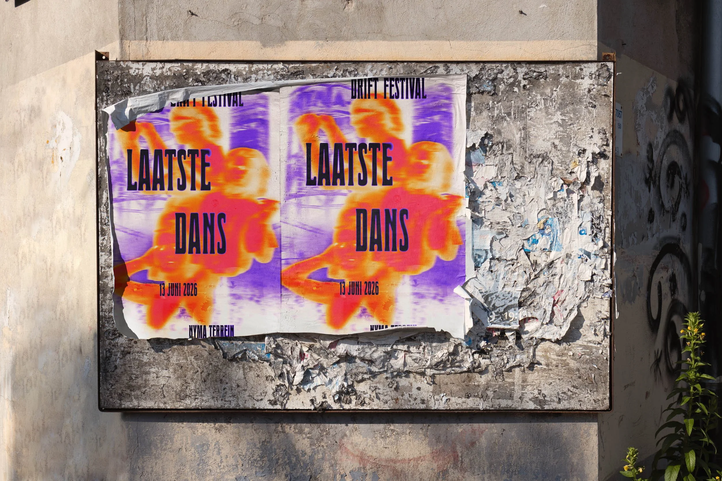
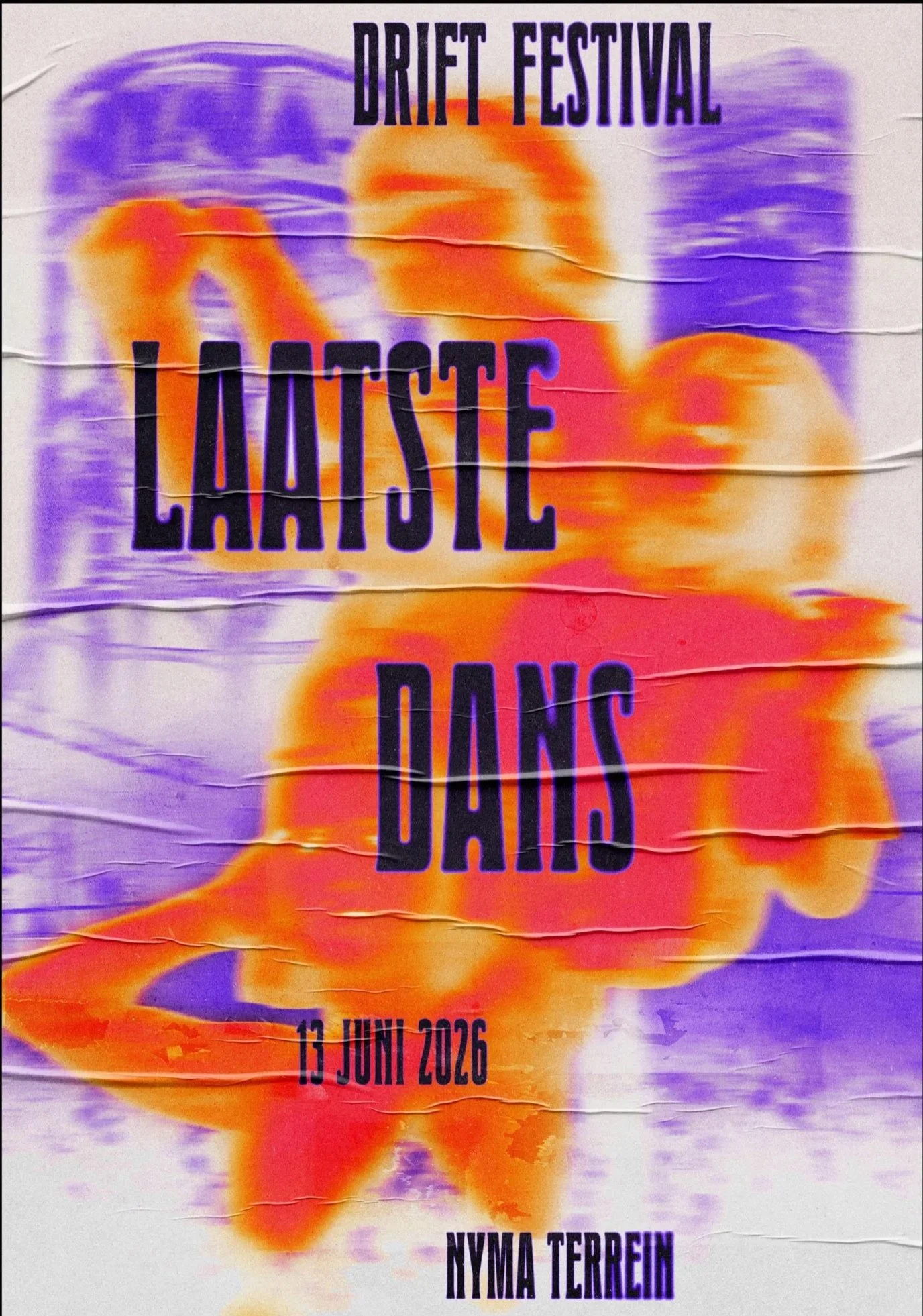
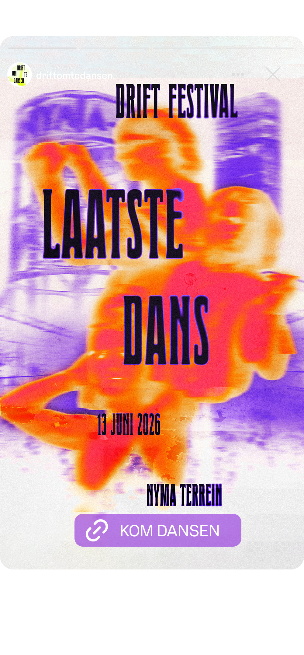
The hero poster brings the concept together in one image. The Nyma tower and Vasim factory appear in the background, a nod to the place that's held so many of Drift's communities and memories over the years. In the foreground, real dancers from Drift's own social media layer over a festival crowd shot, both deliberately blurred to feel like a memory surfacing: vivid, but soft around the edges.
The typography dances loosely down the poster in Drift's own typeface, carrying the line "last dance": both the name of the final edition, and an invitation for one more dance before Drift becomes a memory itself.
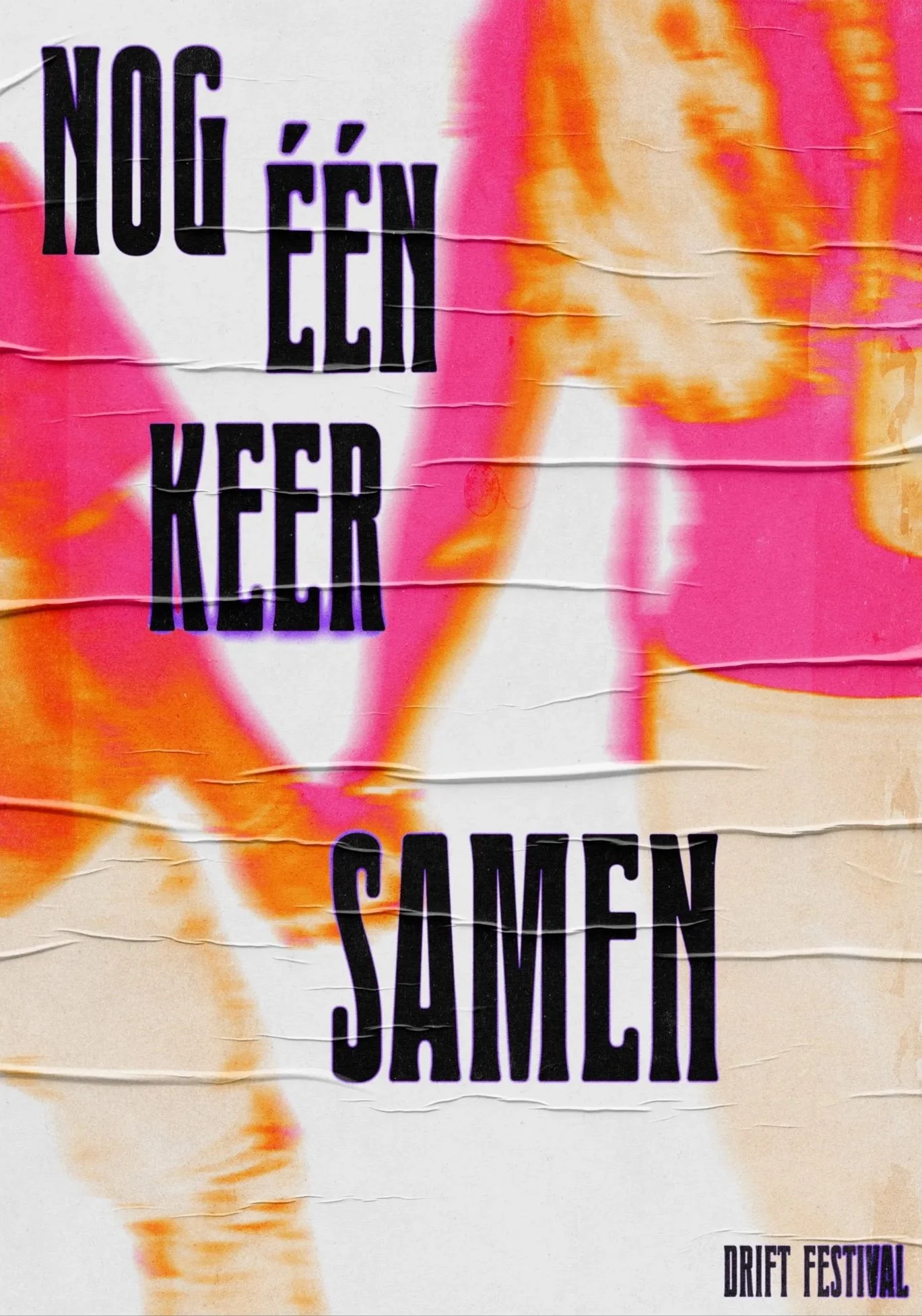
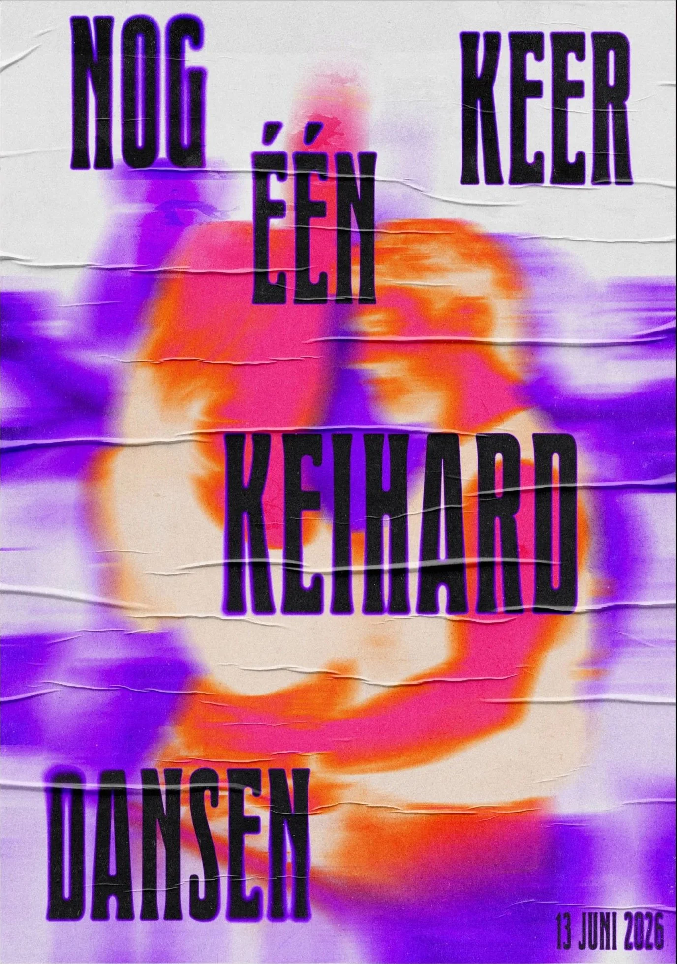
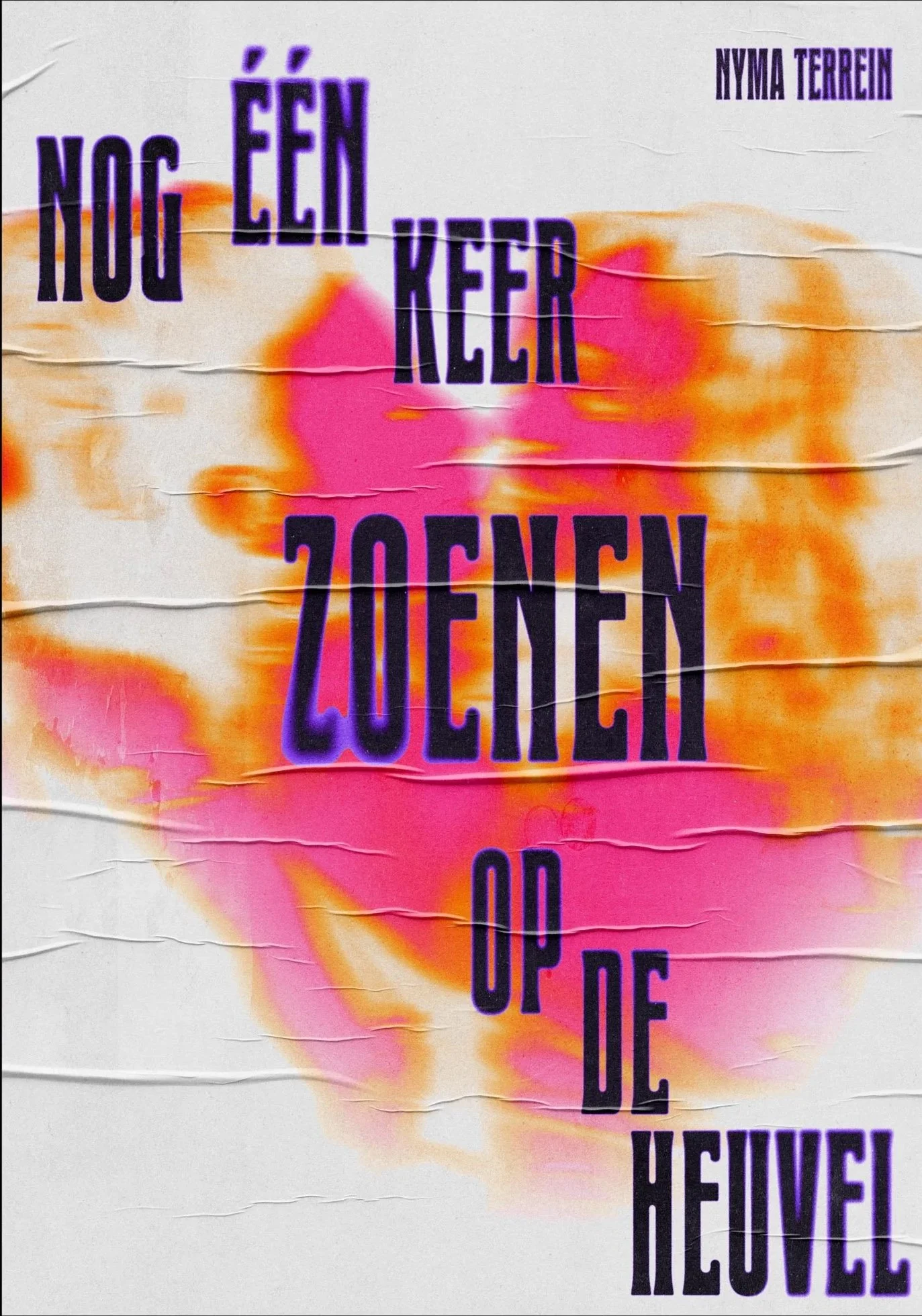
quotes series
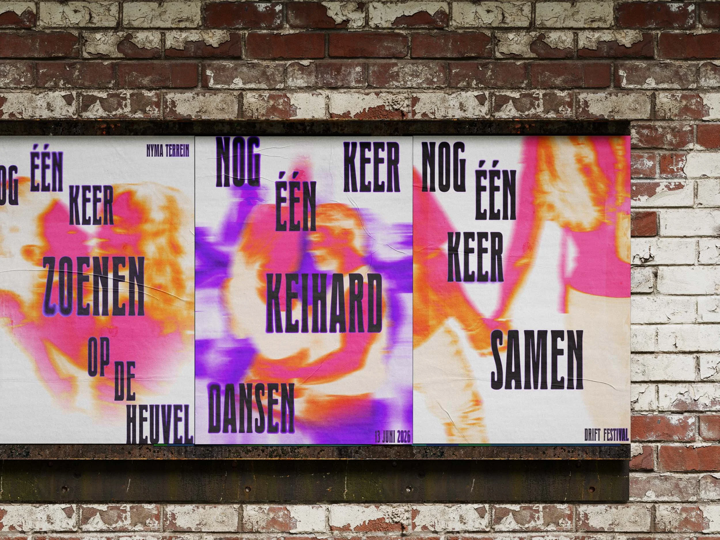
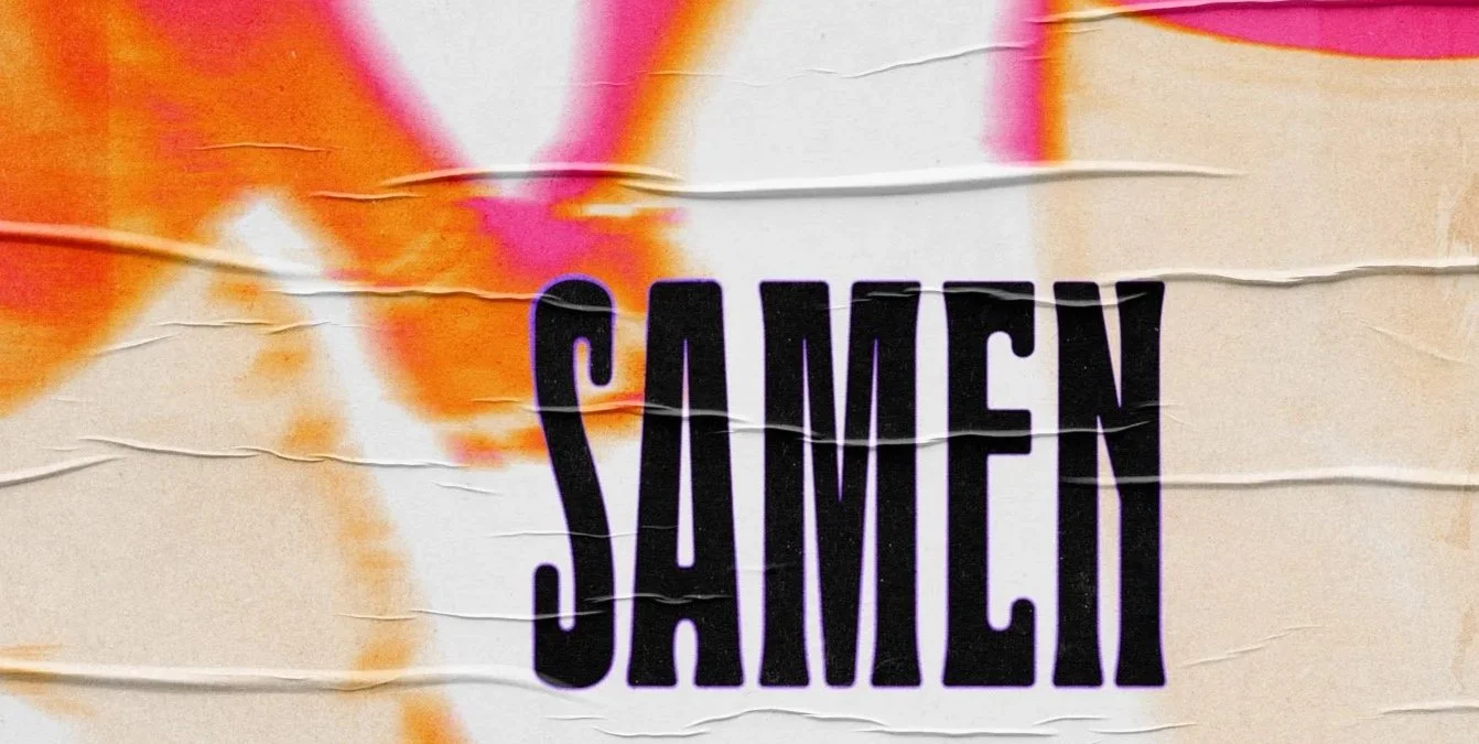
The concept extends into a series of three posters, each built around a recognisable Drift moment, a fragment of the collective memory made visible. The first captures the dance floor's energy; the second zooms into something more intimate, the hill where people find each other in the middle of everything; the third pulls back to the collective, closing on togetherness. Each carries a line from Drift's own farewell statement, placed inside the campaign's visual world. The arc — energy, intimacy, togetherness — mirrors a night at Drift itself.
Social media assets
Three sequential ads, each with a role: the hero-poster ad drives awareness, the quote-poster ad deepens emotional connection, and the animated lineup ad closes with the CTA "come dance" — not "buy tickets," not "find out more." Just come dance. One last time.
motion
Two motion pieces: one built on energy, fast cuts of dancers from past editions, activating memory and FOMO alike, closing on "one more dance, together, one last time." The other announces the lineup through moving silhouettes and animated typography, informational, but still on-aesthetic. Both lean on blur and movement, staying rooted in the campaign's core idea: memories in motion.
visual identity
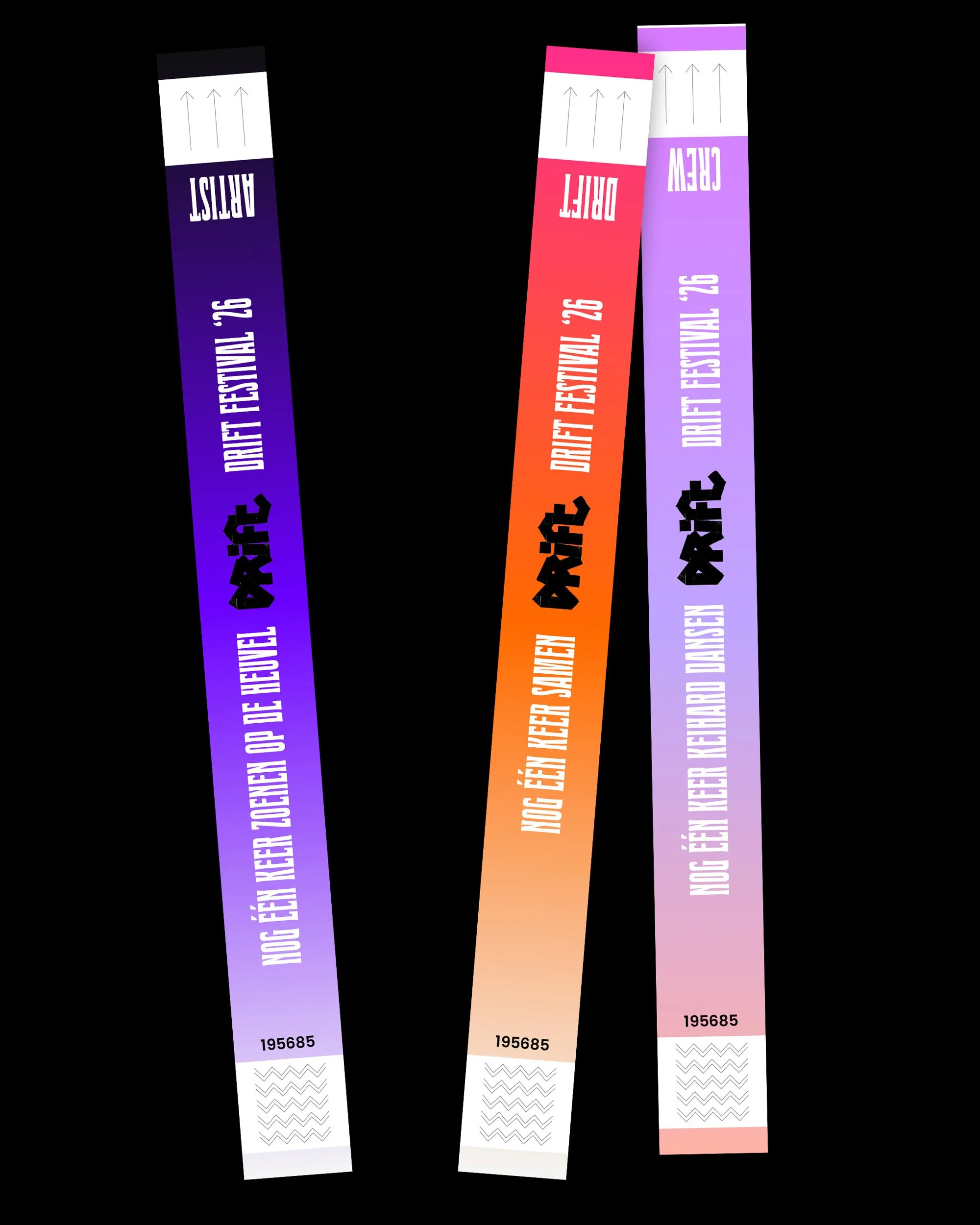
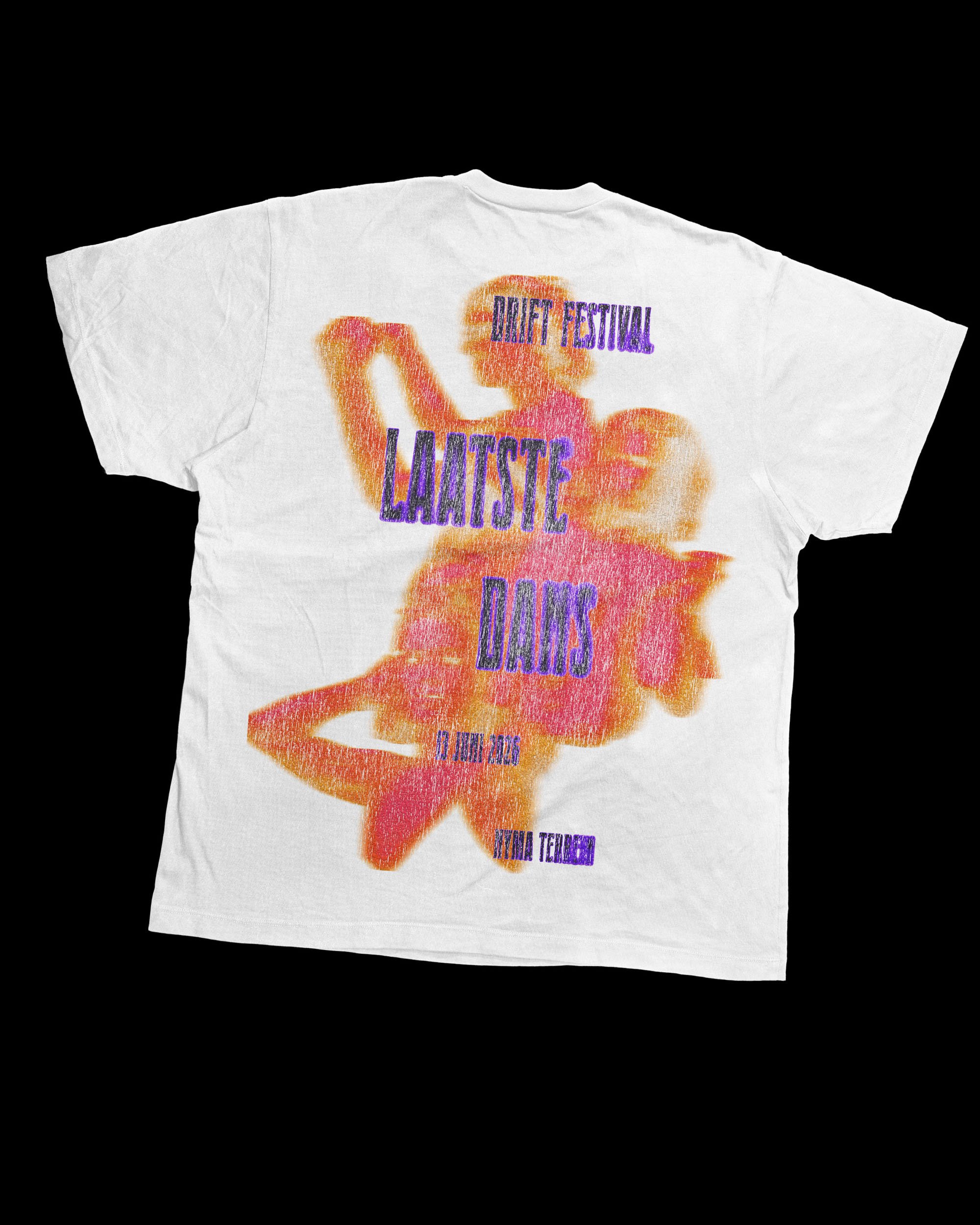
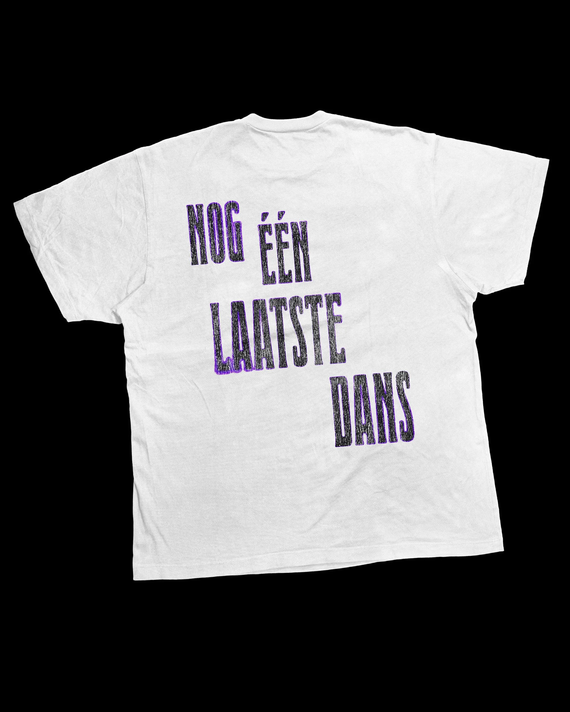
the visual identity is translated into different applications. ranging form physical outings on site to merchandise to bring the campaign to live in the festival context.