drift: laatste dans
A campaign concept for the final edition of Drift Festival,
built around memory, connection, and the feeling of "one last time."
https://driftomtedansen.nl/editorials/drift-festival-2026-wordt-de-laatste/
Drift has been a fixture in Nijmegen's electronic music scene for over 15 years. With the announcement that 2026 will be its final festival edition, something special emerges: not just a festival, but the end of an era.
This campaign translates that moment into a visual and emotional experience.
After 15 years, Drift isn't just made up of editions. it's made up of memories.
The campaign focuses on those memories as loose fragments: moments of connection, energy, and intimacy.
At the heart of it is the idea of "one last time."
one final chance to experience these moments before they're gone.
memories/moments
blur, grain, imperfection
Memories aren't sharp or perfectly lit. They come back blurry, fragmented, imperfect — the way an analogue photograph fades at the edges or catches unexpected grain. That quality of imperfection is what makes something feel like a memory rather than a document. So instead of clean, high-production visuals, the campaign deliberately embraces blur, grain, and imperfection as its core aesthetic.
creative direction
Over 15 years, Drift has accumulated something more than a lineup or a location — it has built a collective memory. Flashes of a set, a face in the crowd, a feeling you can't quite name. The visual language of this campaign is built around that idea: what does a memory actually look like?
collective/connection
people, emotions, interactions
THe visuals of the campaign all involve one of the things that are what makes drift, drift: the people, the emotions and the interactions.
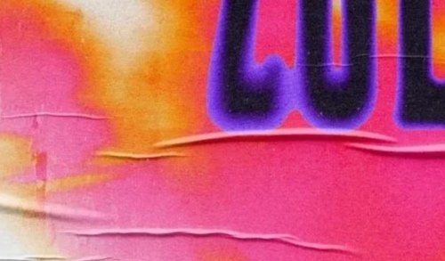
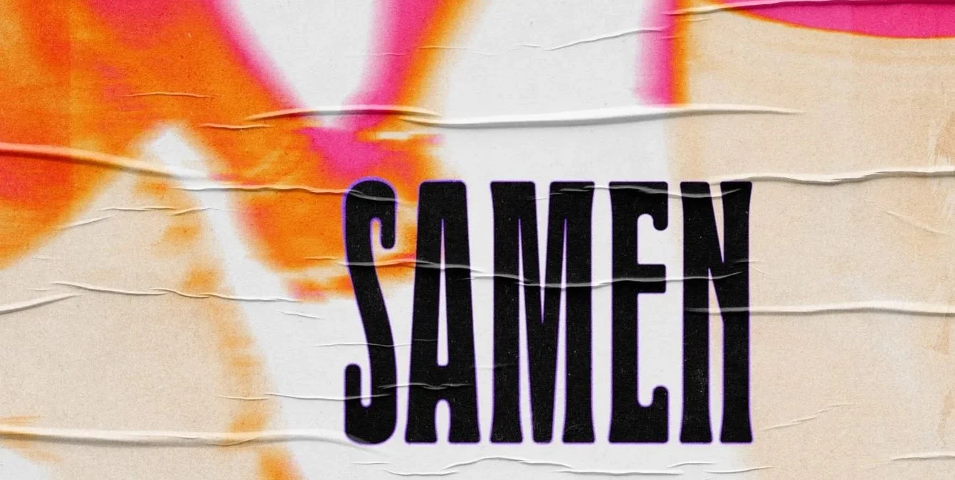
color/typeface
warm “club”colors, expressive typography
warm oranges and purples are the base of the campaign, serving as an ode to the club-like origin of drift. The typography uses the existing fontfamily drift uses and the expressive nature of the brand.
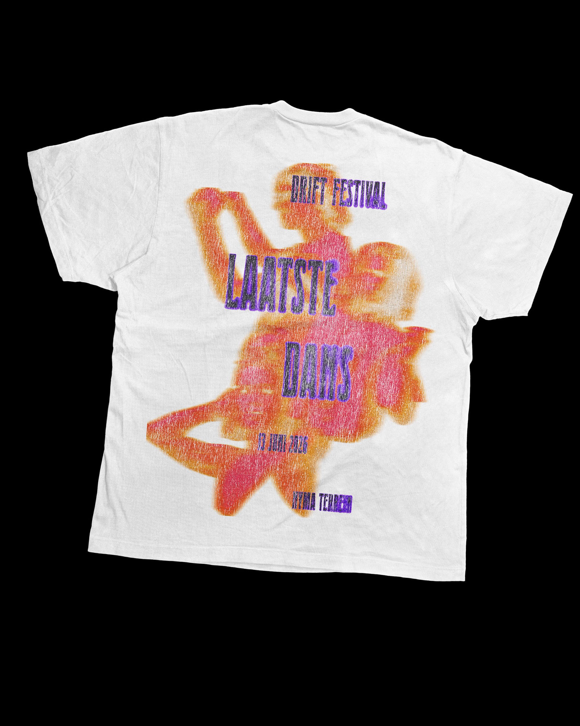
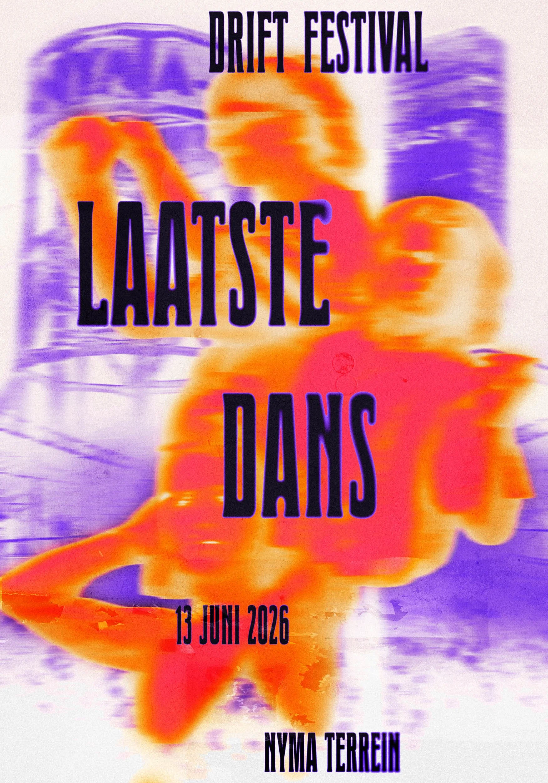
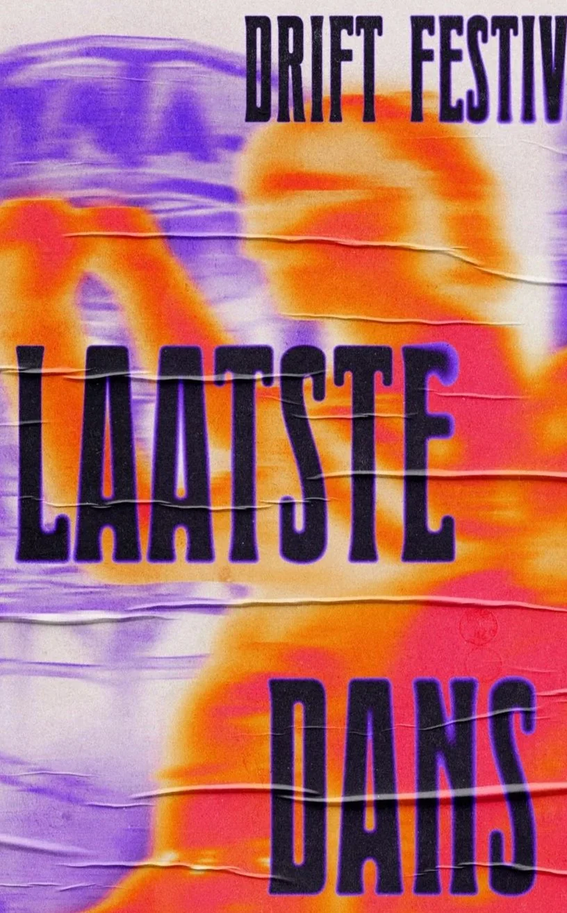
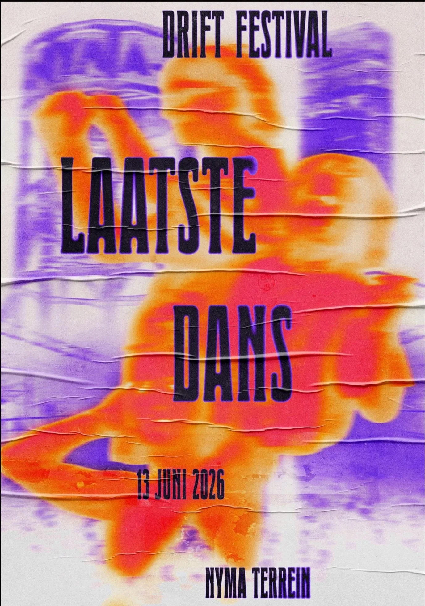
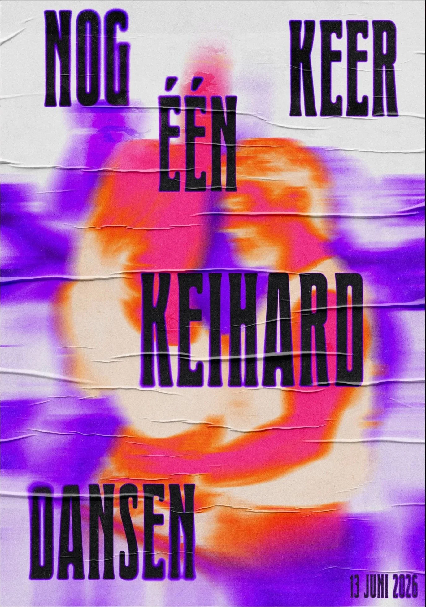
The hero poster brings the full concept together in a single image. At the top, the Nyma tower and the Vasim factory are rendered in the background as a quiet nod to the place where it all happened. These landmarks aren't just decoration, they carry meaning. Drift's own farewell statement acknowledged that this location has become home to so many communities over the years, a place where countless memories were made. Grounding the poster in that specific, irreplaceable place felt essential.
Beneath that, a crowd shot from the festival fills the middle of the composition, with three dancers layered above it, sourced from Drift's own social media. Real people from real editions. Both the background and the foreground are deliberately blurred, simulating the sensation of movement and the way a memory surfaces: vivid in feeling, soft around the edges.
The typography flows from top to bottom in a loose, dancing arrangement, mirroring the movement of the people in the image. It carries the central message: "last dance." A phrase that works on two levels. It refers to the final edition of the festival, and it's an invitation: we get one last dance together before Drift becomes a memory itself. The font is Drift's own existing typeface, keeping the campaign rooted in the brand's identity while the expressive placement gives it new emotional weight.
hero
poster
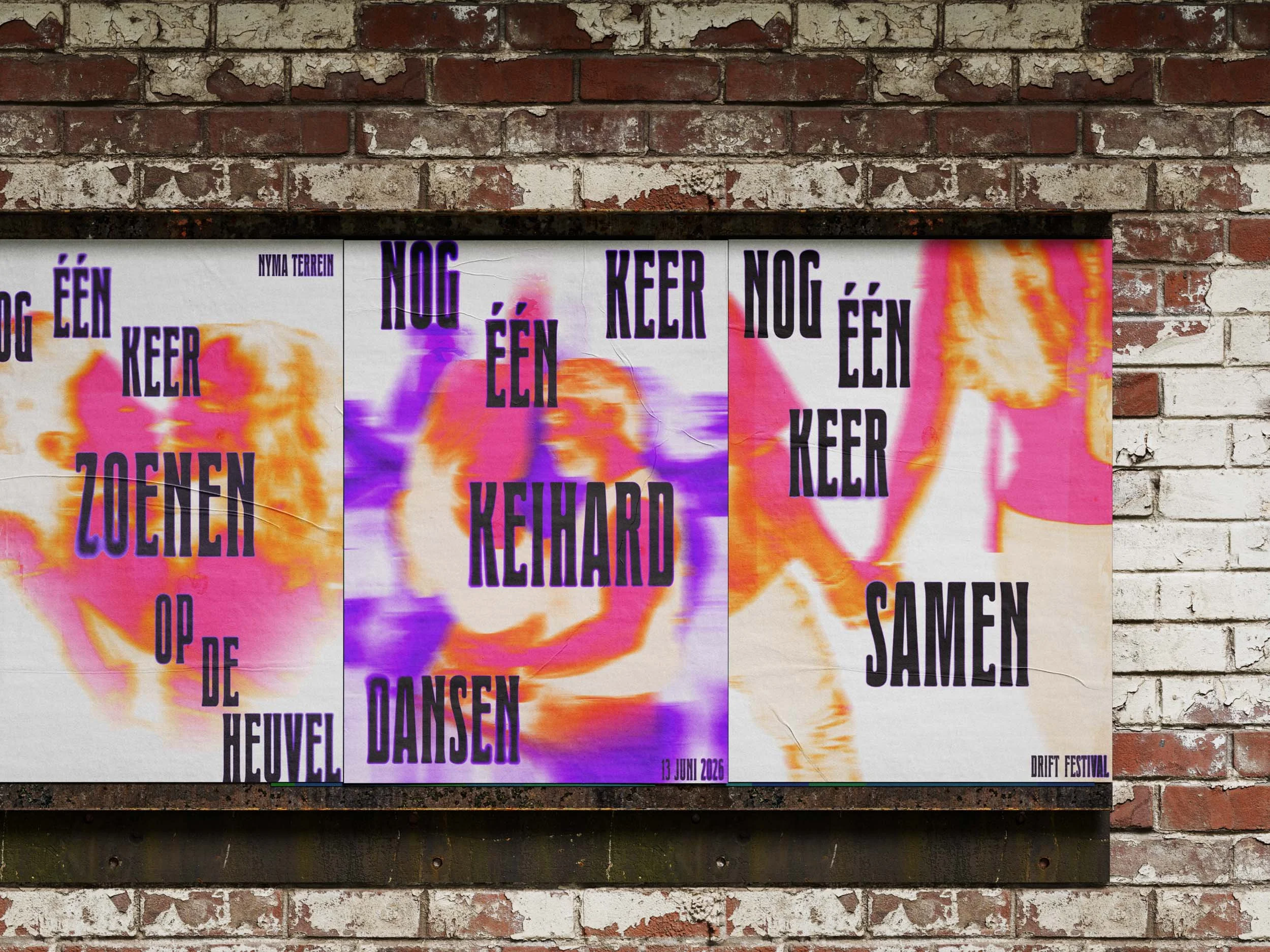
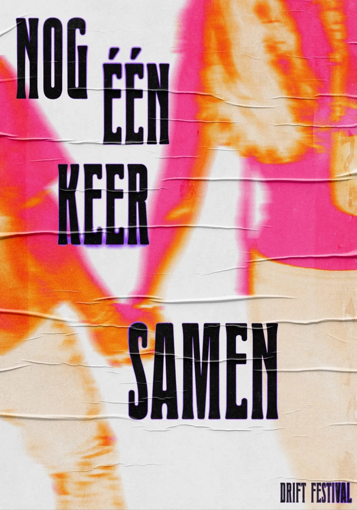
The campaign is translated into a series of three posters, each one built around a recognisable moment from the festival. A fragment of the collective memory, made visible.
The first captures the energy of the dance floor, the feeling that has always been at the heart of Drift. The second zooms in on something more intimate: making out on the hill, a location that has become an anchor of the festival in its own right, the place where people find each other in the middle of everything. The third pulls back out to the collective, closing the series with a quote about one last time together.
Each poster carries a quote taken directly from Drift's own farewell statement, words they chose to say goodbye with, now placed inside the visual world of the campaign. The progression is intentional: from energy, to intimacy, to togetherness. The same arc a night at Drift might follow.
quotes
series

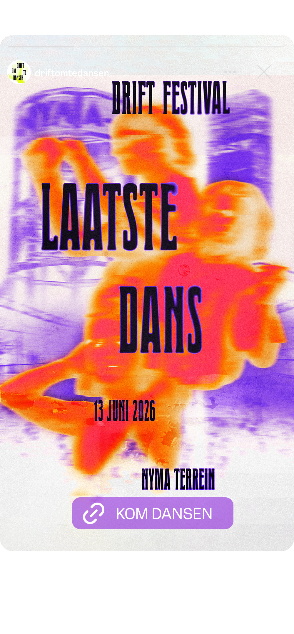
The campaign is extended to social media through three sequential ads, each serving a different purpose in the marketing process.
The first ad is built around the hero poster. It carries all the essential information and functions as an awareness piece, introducing the campaign and the news of the final edition to a wider audience.
The second ad uses one of the quote posters, the one about one last time dancing together. Where the first ad spreads the word, this one deepens the emotional connection. It picks up recognisable words from the hero and focuses them into a single feeling: the dancing, the togetherness, the finality of it.
The third and final ad is the animated lineup piece. By this point the audience has seen the campaign, felt the emotion, and now has one thing left to do. The call to action on the button reads "come dance," a phrase that carries the full weight of the campaign in two words. Not "buy tickets." Not "find out more." Come dance. One last time.
social
media
assests

Two motion pieces extend the campaign into video, each serving a different purpose.
The first is built around energy. Flashes of dancing people, captured at earlier editions of Drift, cut together to recreate the feeling of being there. The pacing is fast and alive, designed to activate the collective memory of anyone who has attended before and to make those who haven't feel like they're already missing something. The text reinforces the central message: one more dance left. Come do it together, one last time.
The second motion piece serves an informational purpose but stays true to the campaign aesthetic. It introduces the festival lineup through moving silhouettes of artists and dancing, animated typography spelling out their names. Information and feeling, working at the same time.
Both pieces use blur and movement as a visual throughline, keeping them firmly rooted in the campaign's core idea: memories in motion.
motion
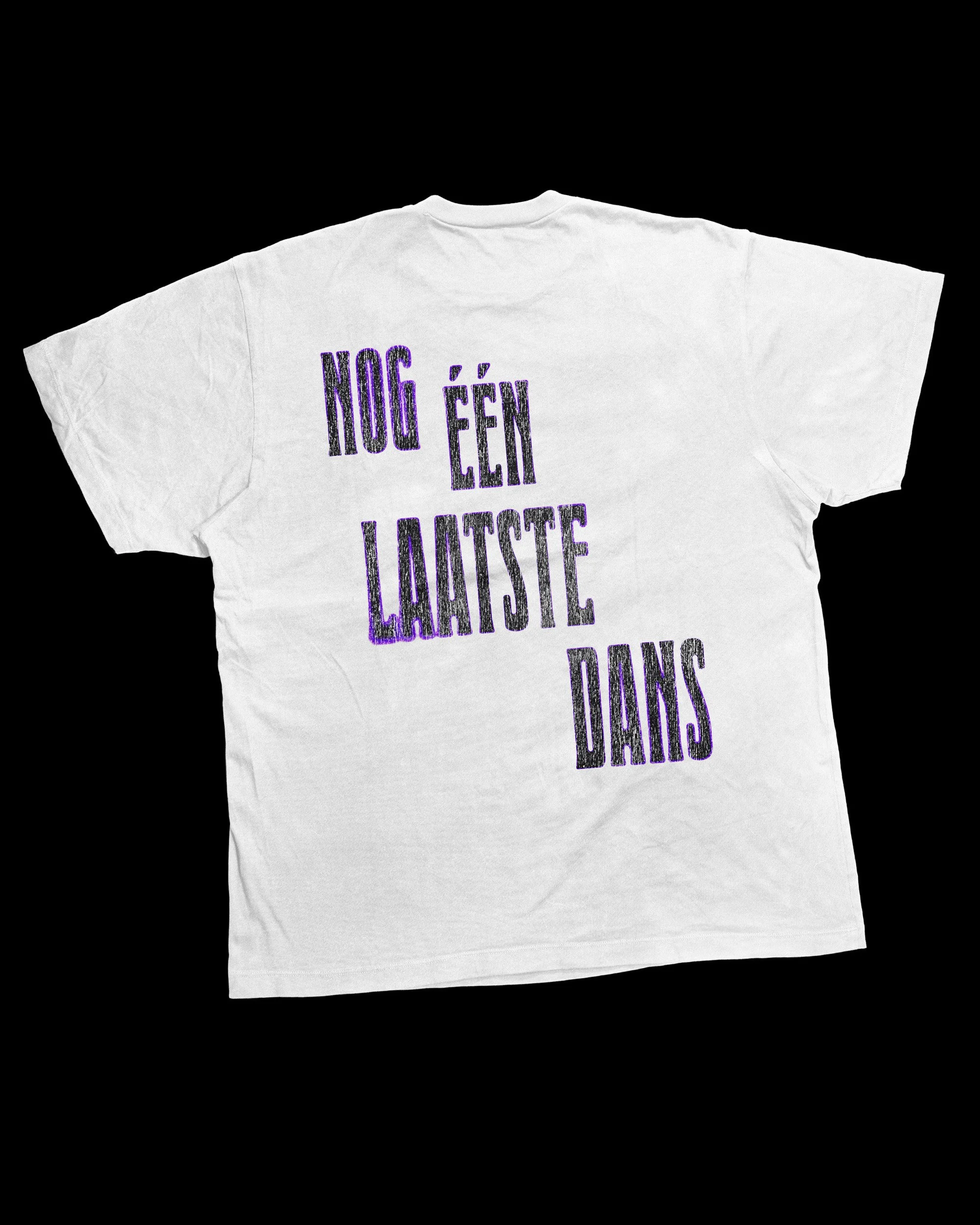
the visual identity is translated into different applications. ranging form physical outings on site to merchandise to bring the campaign to live in the festival context.
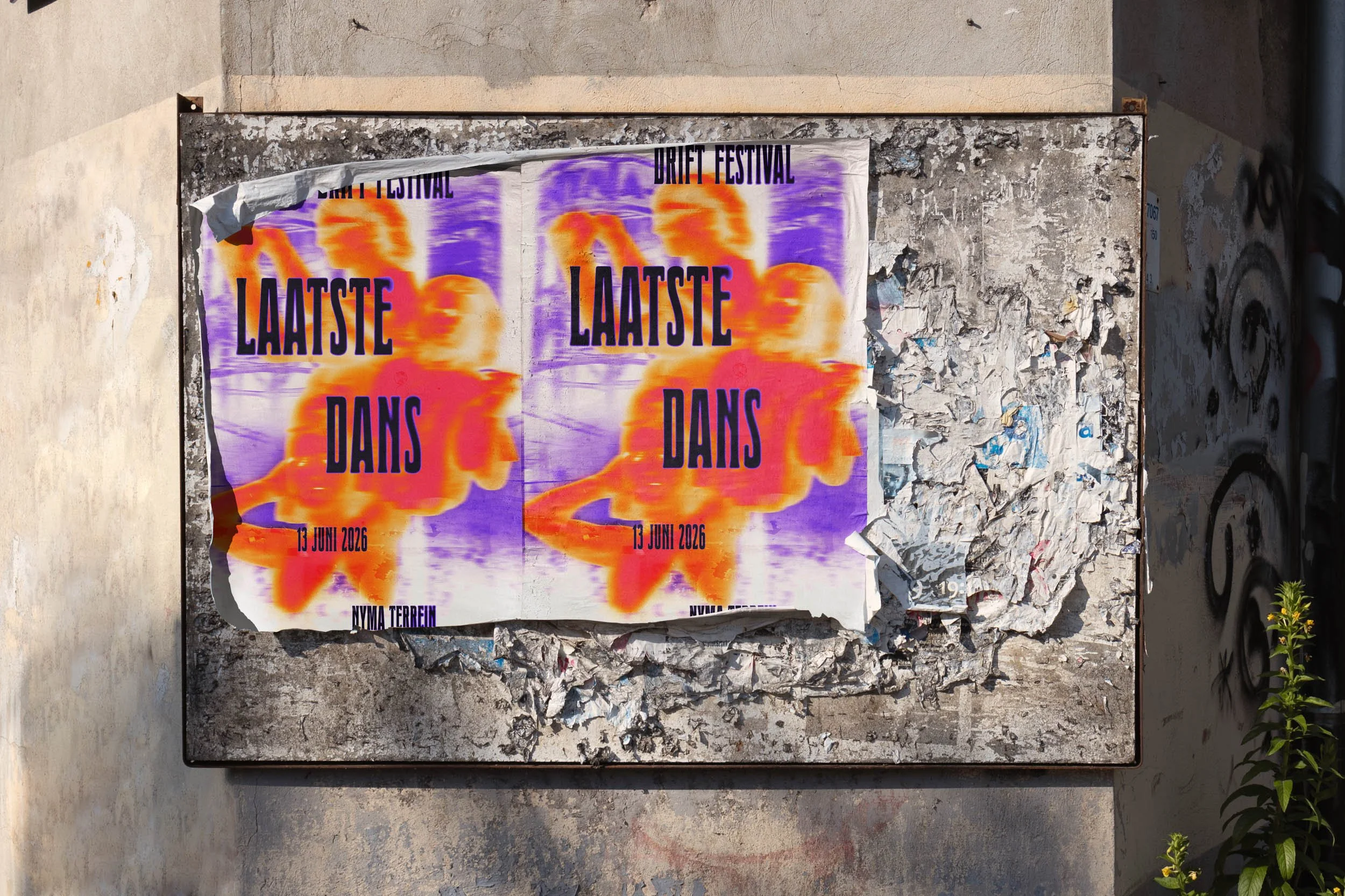
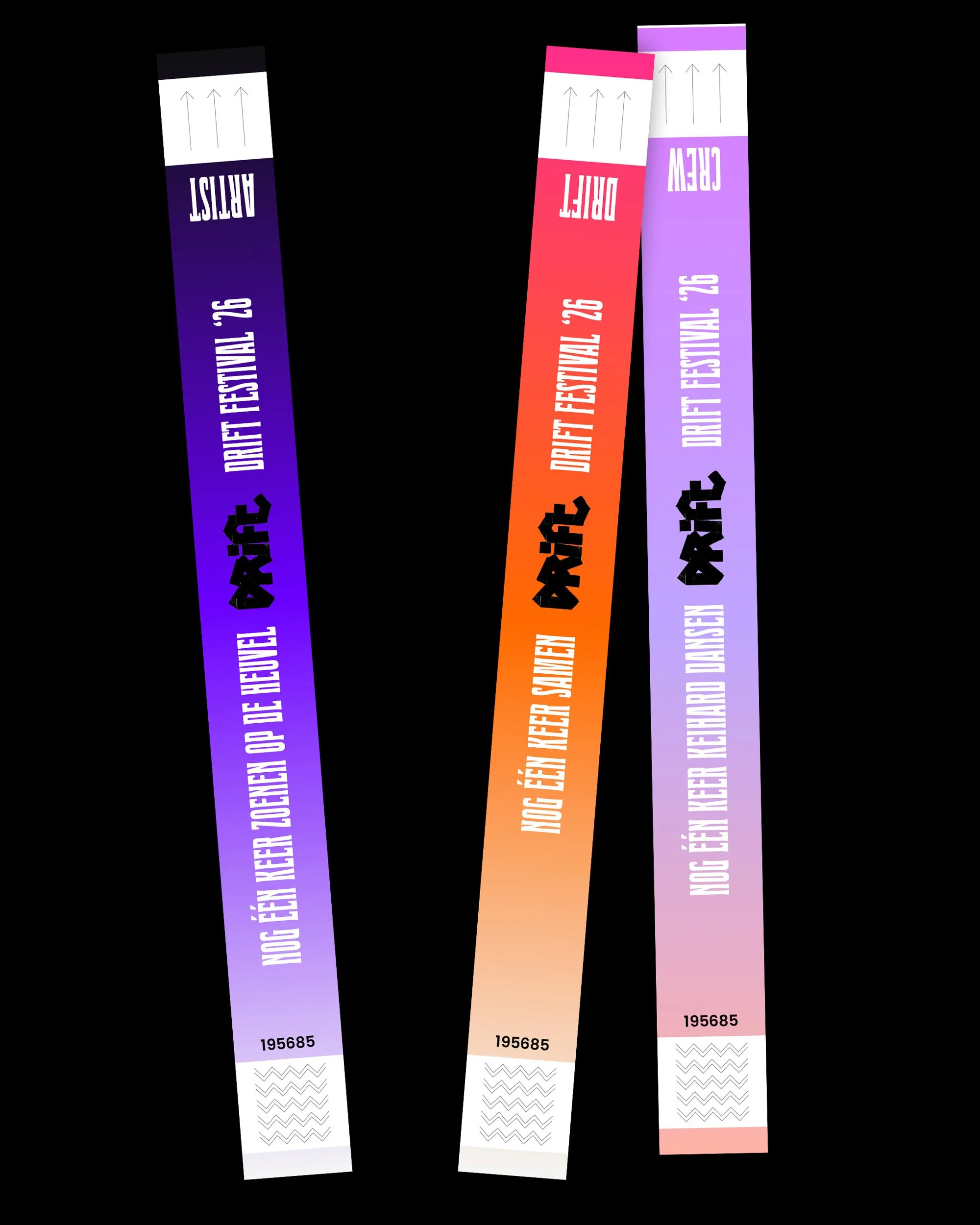
in the wild